I have always been quite involved in the community, coaching sports teams, sitting on community group boards and I do my share of pro bono work. An old friend sent me an email the other day, desperately looking for some help on designing a logo for a basketball program she was running at the Hyde Creek Community Centre. 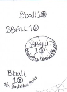 She needed something catchy and cool the teens wouldn’t be embarrased to wear as a t-shirt or even be part of. She sent over her rough concept which was great, gave me the title and a couple catch phrases to work with. I dug into my trusty font vault and found a nice font that wasn’t too graffiti styled but still was fun and casual. I through in a little swoosh stripe to add some motion and some extra sporty outlines. It’s important to take into consideration the final use of a logo and I made sure this one would easily be used for a 3 or 1 colour screen for getting t-shirts done.
Client Feedback:
I LOVE IT!!
Thanks Randy!! You’re awesome!
Maria :o)

3 color version using black, white and pantone 21c

Black and white version
 Panthermedia has recently sent a very successful email newsletter on behalf of The Hockey Shop.
 Smoke Inc. is a Canadian business founded in April 2010.
 She needed something catchy and cool the teens wouldn’t be embarrased to wear as a t-shirt or even be part of. She sent over her rough concept which was great, gave me the title and a couple catch phrases to work with. I dug into my trusty font vault and found a nice font that wasn’t too graffiti styled but still was fun and casual. I through in a little swoosh stripe to add some motion and some extra sporty outlines. It’s important to take into consideration the final use of a logo and I made sure this one would easily be used for a 3 or 1 colour screen for getting t-shirts done.