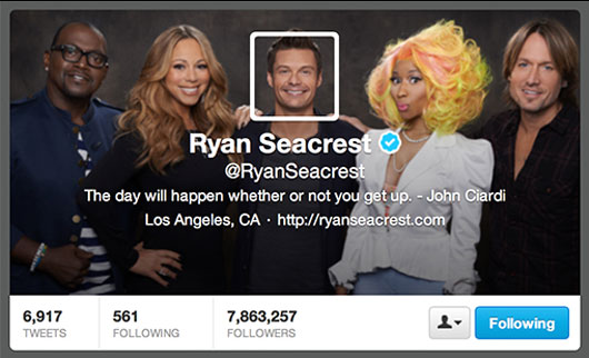
Twitter rolled out a new header option for your profile last week which are very reminiscent to Facebook and google+ but IMHO fall short. I am all about customization and the ability to build your brand through good design, unfortunately Twitter ‘s really limited your options. The header image is 520px x 260px and is overlaid by a transparent black gradient, a centred profile pic, then a few lines of white type with your twitter account, website and bio excerpt. The black gradient works ok when your bg image is an actual photo but over a solid colour is just dirty.  . Your profile avatar is centered with a white border which really limits your design. Basically we just need to get creative and work within the limits of the feature or just bail out and keep the old one. At this point, you are not required to have a header image.
Personally I think it looks best if you can include the twitter background image into your profile pic so it is part of the design instead of just plopped on top. Here are a few creative examples that do work.

Ryan's was the first one I saw using is head overlay

Another good head profile use

This one is pretty fun, who doesn't like a little pong.
If you would like some help with your twitter header design, send us an email. sales@panthermedia.com

